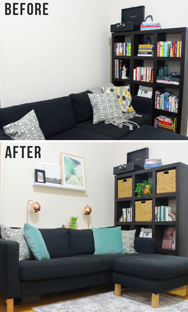
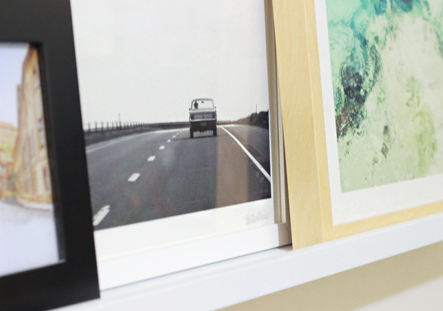
I’ve been bursting at the seams to share the before and after of our living room makeover with you all, and it’s finally here! We’ve been in our apartment for 2 years now (and are getting ready to renew the lease for another year) which left us looking around at the things we’ve been putting off for awhile now.. including this main area of the living room. While we liked the comfortable couch and bookcase, the rest felt unfinished and scattered. Worse than that, it just didn’t really reflect Adam and I’s style. So when Minted let us pick out a few new pieces of artwork it seemed like the perfect opportunity to really redirect the room. We chose two original photographs (that come framed and with the artist’s signature), one of crashing waves (being in or around water is where I feel happiest and shades of blue/green are always the colors I’m drawn to most) and another of an old Mustang on the open road (a nod to our cross-country road trips, Adam’s love of cars and setting out on new adventures together). And from those two pieces of art.. things really took off.
SHOP THE STORY
PLUS! ENTER FOR THE CHANCE TO WIN $150 TO MINTED.COM HERE
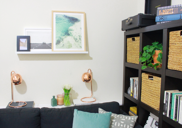
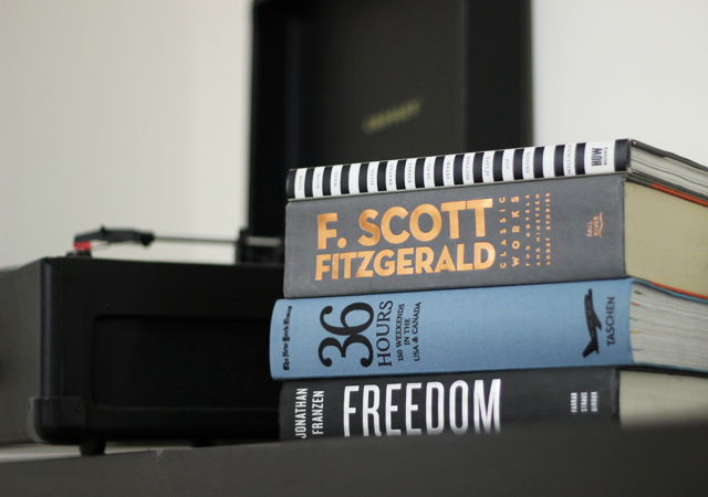
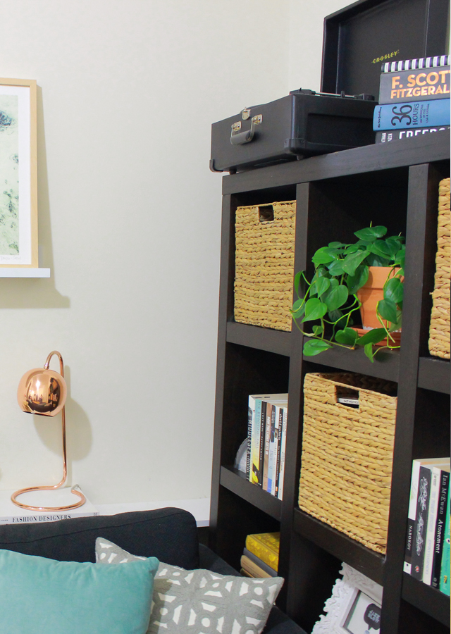
Without spending a fortune, we tried to address some of the issues that really bothered us. For me, it was the visually cluttered bookshelves. So with the help of a few storage baskets I stowed away brightly colored books and kept out my favorites that were in a more neutral palette. Plus, brought in a friendly houseplant that used to live in the bedroom. The record player (a Christmas gift to Adam a few years back) and agate bookends (souvenirs from New Mexico – but these are similar) are both favorites that stayed in place.
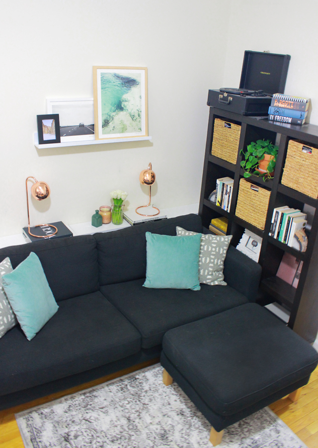
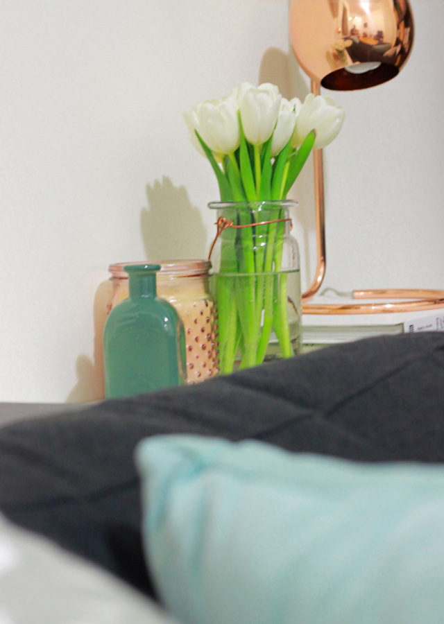
For Adam, it was the space behind our couch (an odd gap due to pipework) that we never quite knew how to deal with. The solution – installing 3 simple white shelves, end to end, to create a fake console table where we could add extra lighting (perfect for reading or late night computer work). I’m thrilled with how this turned out, and well, in general thrilled with how handy he is. We actually found some cute living room lighting which really makes the room much brighter!
The artwork took center stage above the couch (on a slim ledge shelf along with a small framed postcard we picked up while visiting Prague last year) and is a great focal point, plus ties together the colors and overall vibe of the space. Neutrals, mixed textures, touches of blues/greens, and accents in rose gold and copper.
We kept two of the throw pillows we already had, then added two more for color plus a lightly patterned grey rug to tie things together and bring in more texture. I’m amazed at how little we actually bought new and how radically different the space looks and feels. If you’re in need of your own room refresh I truly do suggest having a look at Minted (their selection is amazing and prices for one of a kind artwork are super affordable) and finding artwork that really speaks to you and the space, then using that as a jumping off point. All in all, a major improvement around the Steele Maiden household.
P.S. Don’t forget to enter to win $150 to Minted.com to kick start your own mini makeover!
